
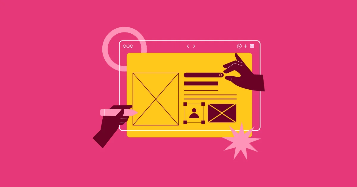
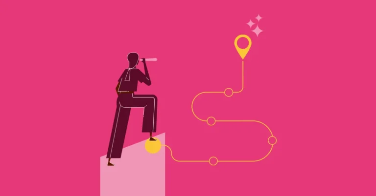
College Website Redesign: Where First Impressions Begin
Your college website is often the first and most important interaction anyone has with your institution. But too many education websites are stuck in the early 2010s: slow, cluttered, and impossible to navigate on mobile in need of a complete college website redesign.
In today’s digital-first world, your website isn’t just an information dump. It’s your front door, virtual tour, application guide, faculty showcase, and trust-builder all rolled into one.
A poor website experience doesn’t just frustrate. It erodes trust. And in the competitive global higher education landscape, that’s a risk no institution can afford.
The Must-Haves for a College Website Redesign
Let’s break down what you actually need to focus on in a modern redesign, not just to look good, but to drive action and trust across all your stakeholders.
1. Clarify Your Goals Before You Touch the UI
A good college website redesign starts with clarity, not code. Ask:
- Are you struggling to attract domestic or international students?
- Are faculty unable to find academic policy documents or update pages?
- Do recruiters have a portal or are they bouncing off without engaging?
- Are alumni getting lost while trying to donate or reconnect?
Build for all, but prioritize user journeys.
Pro tip: Segment your audiences before your design begins – students, faculty, alumni, parents, recruiters – and map journeys for each.
2. Prioritize Mobile-First, Not Mobile-Optional
In India, over 70% of young users browse on mobile. Globally, mobile search dominates across age groups. Yet many college websites still have clunky navigation and outdated designs on small screens.
If it doesn’t load fast, read clearly, and lead to action on a phone, it’s time to rebuild, not just patch.
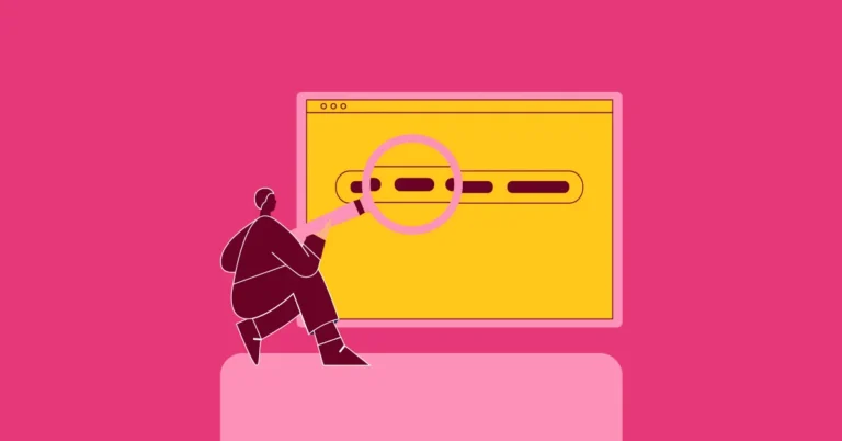
3. Navigation That Works Like a Conversation
A visitor shouldn’t have to click five times to find your faculty list or hostel details. Clear navigation = higher engagement.
Use these rules:
- Use plain language (not “Academics Nexus,” just “Academics”)
- Keep menus under 7 main headings
- Include smart search and quick links for popular actions (Apply, Fees, Downloads)
4. Showcase More Than Just Programs
Your courses are important. But your student culture, faculty achievements, alumni success stories, placements, and community outreach are what bring them to life.
Consider dedicated sections for:
- Faculty Profiles with research highlights (great for recruiter trust and international collaborations)
- Alumni Spotlights with testimonials and career growth
- Recruiter Info Desk with placement stats, company partnerships, and contact points
- Parent FAQs (especially useful during admission cycles)
5. Integrate Admissions Campaigns Seamlessly
Your website should support your campaigns, not operate in isolation.
If you’re running digital ads or emailers during admission season, make sure:
- Landing pages exist and match your campaign message
- CTAs are trackable and easy to find
- Forms are short, mobile-friendly, and don’t break mid-submission
6. Use Visual Identity That Reflects Your Brand
Don’t underestimate the power of design. Colors, typography, photography, all work together to build perception.
- Use real student and campus photography (no stock, please)
- Ensure accessibility with proper contrast and alt text
- Build brand consistency across digital platforms
If you’re looking for inspiration, the IIM Ahmedabad website is a strong example of an institution with modern visuals, structured content, and brand clarity.
7. Update Content Regularly – Not Just Once a Year
Old event posters, outdated fee structures, or non-functional faculty links signal neglect. Assign ownership to different departments or empower your communications team with a CMS they can actually use.
Choosing the Right CMS: WordPress, Drupal, or Something Else?
One of the most crucial backend decisions in your college website redesign is the Content Management System (CMS). The CMS determines how easily your internal teams can update, manage, and scale content.
WordPress: Great for Most Colleges
- Pros: Easy to use, cost-effective, vast plugin ecosystem, highly customizable, strong community support.
- Best for: Private colleges, autonomous institutions, and marketing-focused universities that want frequent updates, blog posts, event pages, or landing pages.
- Scalability: Excellent for mid-sized institutions; manageable for larger ones with the right hosting and dev support.
Drupal: Robust and Enterprise-Grade
- Pros: High security, extremely scalable, strong user permission controls, better suited for multilingual/multi-site setups.
- Best for: Government universities, large research institutions, or universities with complex structures and multiple sub-sites.
- Scalability: Designed to handle heavy traffic, complex data, and sophisticated access hierarchies.
Others:
- Headless CMS (like Strapi or Contentful): Ideal for institutions needing API-first flexibility across apps/websites but require developer support.
- Custom CMS: Risky unless you have in-house devs and long-term support in place.
Pro tip: Let your internal team test the CMS before finalizing. If they can’t use it with minimal training, it’s the wrong choice.
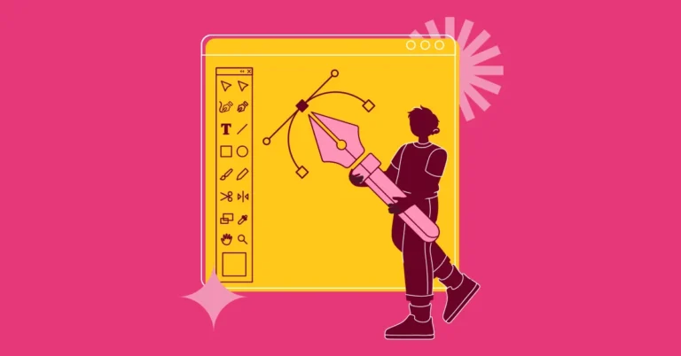
How to Choose the Right Website Redesign Partner

The success of your redesign isn’t just about good code or pretty visuals—it’s about strategy, empathy, and educational insight. Here’s what to look for:
1. Sector Experience
Choose an agency or team that has experience with higher education websites or student-facing platforms. They’ll understand nuances like academic calendars, admissions funnels, and compliance needs.
2. Collaborative Process
Ask about their design and development process. Does it include:
- Stakeholder interviews (faculty, students, admins)?
- Sitemap and content audits?
- Wireframes and UI/UX testing?
3. Design + Content Strategy
A modern education website is not just designed—it’s written with purpose. Ensure the team offers copywriting or content advisory services, not just UI mockups.
4. CMS Training & Handover
Avoid teams that “lock” you out after handover. Choose partners who offer post-launch support, CMS training, and maintenance plans.
5. Performance-Driven Approach
Ensure they use KPIs like form conversions, mobile speed, bounce rates, and SEO visibility to track success.
💡 Want someone who understands both higher ed and digital design deeply? EvolvEd brings design, content, and education strategy together in one cohesive approach.
Bonus Tips for Stakeholder-Specific Engagement
For Faculty:
Make internal resources, research updates, and public profiles editable or easily accessible.
For Alumni:
Showcase success stories, enable easy networking/donation, and create a space to stay involved.
For Parents:
Include safety measures, hostel info, placement stats, academic calendars. Add a “Parents Corner” for transparency and trust.
For Recruiters:
Provide placement history, top profiles, and a quick point of contact. Add a one-click brochure or PPT.
Conclusion: Your Website Is the Heart of Your Brand
Redesigning your college website isn’t about following design trends. It’s about future-proofing your institution’s identity in a digital world where trust is won—or lost—within seconds.
A good website informs. A great one inspires.
It speaks to every stakeholder – student, parent, faculty, recruiter, alumni – and tells a unified story.
At EvolvEd, we help higher education institutions from local Indian colleges to global universities reimagine their web presence with design, messaging, and tech that actually work for today’s users.
📩 Ready to transform your site into your most powerful marketing and engagement tool?
Talk to EvolvEd today and let’s build something your entire community will be proud of.